Showing posts with label Harry Ramsden. Show all posts
Showing posts with label Harry Ramsden. Show all posts
Wednesday, 21 May 2014
Harry Ramsden - Evaluation
Deliverables -
Business Cards
Letterhead
Drinks Mat
Take-out box
Food wrapping
Web design
Overall I'm fairly happy with what I've achieved given the timescale I'd given myself - 2 weeks. During this design period I was also starting another smaller brief. In hind-sight there are a lot of things that I could've done to improve my overall design. For example; During crit sessions and peer review the chip in the fishes mouth had been mentioned about compositionally, at first I didn't really take the advice on board, but nearing the end of the brief I severely restricted this design and only had it among the packaging as I felt it worked well to signify the contents. Another factor to this brief that caused annoyance was the development of my website, the concept worked fairly well, however I'd changed my idea for the web presence twice and then had to rush to complete, in my opinion this shows.
There were numerous ideas I didn't really get time to exploit, I'm disappointed at this but know that I'll be refining this brief to suit my portfolio standard. The ideas consisted of;
The components to the logo could of been dissected and used among the brands utensils, for e.g. Chip forks & Drinks mat.
Mock up versions of the restaurant with the vintage photographs decorating the roof. Moreover I felt the packaging could of been pushed, creating a string of different products wrapped up to create a consistent and appealing range.
Minimising the colour so the logo is the main emphasis and discarding the fish & chip illustration altogether.
The logo I designed, has taken inspiration from the aesthetic of the original Harry Ramsdens logo it has also incorporated the circular design seen in the image next to this. Doing this has created the modern adaptation that I set out to achieve. The colour scheme is also a modern adaptation of the original colours found in Harry Ramsdens, Overall I’m very happy with the logo, I feel it pays tribute to Great Britain while also celebrating Harry Ramsdens past.
The logo I designed, has taken inspiration from the aesthetic of the original Harry Ramsdens logo it has also incorporated the circular design seen in the image next to this. Doing this has created the modern adaptation that I set out to achieve. The colour scheme is also a modern adaptation of the original colours found in Harry Ramsdens, Overall I’m very happy with the logo, I feel it pays tribute to Great Britain while also celebrating Harry Ramsdens past.
Monday, 5 May 2014
Harry Ramsden - Photographs
A comparison of background/ backdrop display…
I used this an opportunity to find out whether a fish & chip shop identity would benefit from using wood in the background. The wood looks appealing up close however on the whole, it drowns the design and doesn't really let it pop. In light of this I've chose to photograph elements on a white background.


As you can also see,


Thursday, 3 April 2014
Harry Ramsden - Mid Boards
Due to the file size and compression process to upload via 'Issuu', some of the more intricate designs and photographic work has lost some detail. The problem will be rectified by supplying printed versions of these boards.
Harry Ramsden - Trial and tribulation, exploration of idea designs
This blogpost is summarising all of the key design decisions that effected my overall deliverables...
Type; My search began at very loose flowing, cliche type that would usually be for a fish & chip shop, when I realised this, it began to define what sort of appeal I wanted.

After printing the business card I was able to see that the watermark in the bottom-right wasn't really needed. Although there was nothing wrong with it, the logo was strong enough just to be used on the front with the main information on the back and no other design.


I was pleased with how the fish & chips shop box had turned out, my idea of keeping it simple had paid off with the finer details on the sides of the box really standing out. With this in mind, i've decided to discard the fish, this was following a crit feedback in which it got brought up that I should maybe mess around with the composition of the chip in it's mouth etc.


For food-to-go, I used this as a chance to create something heavily involving illustration and type. The fish and chips would be wrapped in greaseproof paper which would then be covered in a trace paper. This is because I thought about personally eating fish and chips and the greaseproof papers don't tend to hold very well when the grease has took ahold. Therefore this extra layer will not only look more attractive, it will also add stability to the fish and chips eating experience.

Inspiration…
Reds Restaurant


Composition & Layout…
I generated various designs in hope of creating some elements for the interior of the restaurant. The logo below was appealing but I could tell straight away it resembled many other logo's and wouldn't really define Harry Ramsdens.

Potential Wall Designs? Following the completion of these and crits, I've decided to discard of these designs, this is on the basis of the chip in the fishes mouth, in hind-sight I think the fish on it's own has more appeal than with the chip as it looks peculiar when on a big scale or in obvious places.


After laser cutting numerous designs, I cut one larger design, the purpose for this would've been for the interior wall display. That's if it were not for the use of colour I applied. I wasn't very keen on how it had dried, being blatantly different from the identity colour meant it didn't really share a synergy with it.


For the interior of the restaurant I began designing a wallpaper with too little time to complete, the basis of the design was successful in terms of the fish, salt shaker and chip. However the colour was totally off, it was too dark for one. It also shared no relevance with 'HR' therefore I decided to leave this design and make sure my other deliverables were of a high standard. I will return to this brief for my Portfolio which is comforting.


Harry Ramsdens - Logo design

The circular badge design has been influenced by a past logo design of Harry Ramsdens, I developed this concept and refined the whole design to supply a logo that is contemporary and new, but also takes into account what Harry Ramsdens where asking for.
The colour scheme takes into account the original Harry Ramsden colours, however I've altered the saturation and hue of these to give it a softer appeal and less serious manner
I'm very happy with how the logo has turned out, Although the development of the logo has been substantial compared to the deliverables I've found comfort in the fact that it answers the brief well and can be extended and fine tuned for my portfolio.
Wednesday, 2 April 2014
Harry Ramsden - Findings

Instead of pointlessly turning my research attention to all types of fish & chip shops, I investigated into high street brands that permeated a sense of luxury into their identities.

After seeing this I was inspired to create my own version of 'newspaper' print, however I'd be making a new approach and applying the idea to food to take out, as oppose to a range in a supermarket.

A bold and classical approach to fish & chips


Instead of focusing on a an image for the logo of this brief, I think it would be a more effective route to use typography as the main feature, as you can see below the subtle edit of the hook among the lettering is enough to give it an identity.

& as you can see from the direction of Harry Ramsdens advertisement below, there is a strong focus on type.
Menu Findings…

For the development of my menu layout I kept it simple and readable, as you can see from the way I've arranged the text I didn't want it to look tacky or similar to other chips, the reason being, Harry Ramsdens is a very expensive chip shop (compared to the mass amounts). With this in mind the advertising had to represent that to a degree. The above advertisement speaks as if it's trying its hardest to sell, whereas the design below speaks in a more reputable tone with the fish & chip shop identity tied into the colouring and branding.

The slightly off blue boxes behind the titles add a small sense of playfulness to the overall layout, this is because it follows a just two columns.

Background Research
Could the introduction of this brief be related to the company going under new management? Although its only for the sale of one restaurant, its the sale of its pinnacle, its original shop! Therefore the company might of thought about re-invigorating the brand to appeal to a modern audience.
"The world's most famous fish and chip shop re-opens today after a speedy turnaround worthy of its colourful history. Portions of skinless haddock, mushy peas and the rest of it will be served again at Harry Ramsden's in Guiseley which closed less than six months ago.
Around £500,000 has been invested in restoring the splendour of the diner at the junction of the roads to the Yorkshire Dales from Leeds and Bradford, a canny site which made the fortune of the original Harry whose first, takeaway-serving hut is still part of the set-up. The restaurant's last owners, the Birmingham-based Boparan Ventures group, have kept other parts of the franchised Ramsden chain but couldn't make a go of White Cross and its 24 staff."


To strengthen my knowledge of Fish & Chips, I looked at a range of fish & chip shop interiors, giving me an idea of the degree to which the interiors are permeated with their identity. Type appears to be quite a consistent factor, from blackboard designs through to the walls. Colours are usually mixtures of blues, silvers, whites, reds and blacks.
As rebranding Harry Ramsden's will not only consist of print based products, I wanted to look at a range of fish and chip shop interiors, to see how a visual identity works within interiors, exteriors and different environments. Colour, type and image evidently create really strong visual identities, that then go to work alongside products such as menus and packaging. Type appears to be extremely important, as it is a way of creating a tone of voice for the brand within a space, whilst colour keeps the aesthetics consistent.
Harry Ramsden's want to create excitement and also represent their heritage. The strongest factor to this brief is making sure you don't steer to far away from Harry Ramsdens history, because its their reputation thats built the company identity overall.
Harry Ramsden's want to create excitement and also represent their heritage. The strongest factor to this brief is making sure you don't steer to far away from Harry Ramsdens history, because its their reputation thats built the company identity overall.
Harry Ramsden - Brief

board
Consideration of products… I need to be aware of the timescale I'll be working too if my other briefs are not to be effected.
- Menus
- Napkins
- Coasters
- Business cards
- Food packaging
- Cutlery
- Napkins
- Coasters
- Business cards
- Food packaging
- Cutlery
- Bags
- Flatpack boxes
- Flatpack boxes
- Website
- Letterheads
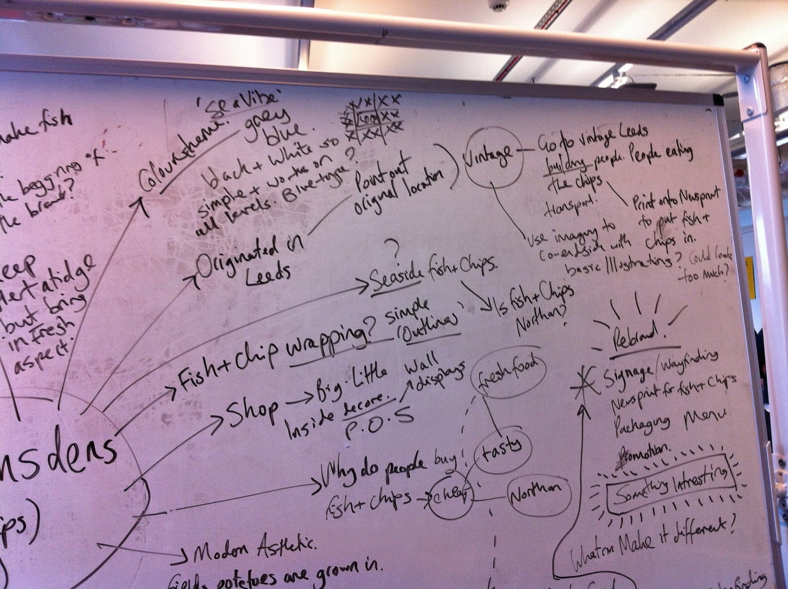
Initial Mind mapping of topic & themes


Subscribe to:
Posts (Atom)
About Me

Copyright 2010. All rights reserved.