Digitising: To do this we scanned in the illustrations making sure the resolution was turned up and then live traced the designs, from here we used the paint bucket tool to fill in the sections colouring in the tonal differences, we started off using a quite realistic colour scheme making sure all the colours were global so that we could easily experiment with the colour scheme.

The close-up image below displays the conversational print in a more stepped out manner, however we needed to densen the pattern which gave it a different aesthetic. In terms of collaboration I felt me and josh worked successfully together, there were times when our schedule's would clash.


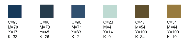
Another one of the requirements of the brief was to present the design in 3 different colour ways we tested several different alternatives but finally settled on these three. These colour ways lent themselves to the elements in the design. The 3 different colour schemes suit the cakes well, referencing different fruits, for instance the jam could be strawberry, raspberry or blue berry. The colour ways are quite different but all work really well with the products.


No comments:
Post a Comment