Archives

Wednesday 30 April 2014

Cath Kidston - Initial design generation

Here you can see the planning of sketches, initial ideas, mixing elements and seeking that vintage style with contemporary appearances.


(detailed approach - loose image quality when shrank)


(Size Variations)


(decided approach)


Wednesday 23 April 2014

Secret 7" - Design work 3


After reviewing my sketches it became a possibility to transfer the street-style to on-screen, during the creative process I thought it would be clever to include a modern adaptation of the original karma coma album. You can see from the two designs I did below that they are both reminiscent of dark creatures. 


During this year I've definitely developed my photoshop skills, I was a keen enthusiast of photoshop in the past but I found it limiting, however now I've become successful at Illustrator, I've found myself using it a lot more, and I've been seeing the effects through my work.


Adopting the rubber tool with a faded outer opacity on a low tolerance makes it easier to blend the surrounding edges of the image into the background, especially a black background.


The shapes you can see below have derived from the set scenery of a Massive Attack concert, I'd also been inspired by the leaflet above which gives off a very dark and crazy aesthetic, perfect for the meaning of Karmacoma.


Distinguishing if the design would look better as a full image or slightly overlapping the label...


As a form of research I printed the vinyl covers onto a glossy paper, this meant I was able to visualise how successful the light bouncing off the designs was, and because of the nature of the design being 'crazy' and 'out of control' I thought it complemented more than say matte paper would of, I was also dealing with photographic imagery which aided my decision.


Tuesday 22 April 2014

Air freshener - Elmwood, design direction

As you can see from the final logo above, it has developed from my initial starting point (noted in an earlier post) and been refined and developed until it's a suitable emblem for the companies ethos of dispersion and cleanliness.

Website proposal: In a technological age, I felt the website needed to have some form of interaction. Running with the theme of air particles and dispersion. I generated an idea where the user could swipe their mouse over the centred blue bar and watch as the white air particles (Odaire) spread through the air, this is both an educational and entertaining aspect of the website.


Concept; create something quirky, contemporary and most all, different. The air freshener market is saturated with scents of food and fruits, which is why I've chosen to create an Air Freshener brand that was clean, comforting, educational and attractive. Traits that you would not recognise through other Air freshener brands such as; Ambi Pure, Glad, Febreeze & Air Wick.

The air freshener would come in a clear bottle with the design heat pressed on, this allows the design to interact with its contents. Giving the impression that the contents (the scent) is made up of these Odaire particles you can see 'dispersing' through the bottle.


Fun & light-hearted stickers that could be placed on rear car windows, folders, window displays that stock Odaire etc.


TYPE: Sans Serif - Basetica. I chose to use a Sans Serif typeface because it's a lot more dynamic, contemporary and reflective of Air fresheners than a serif font which permeates a sense of tradition and history.

LOGO: Due to my whole concept based around the idea of air particles and dispersion, I created a symbol that demonstrated the splitting of Odaire's particles.

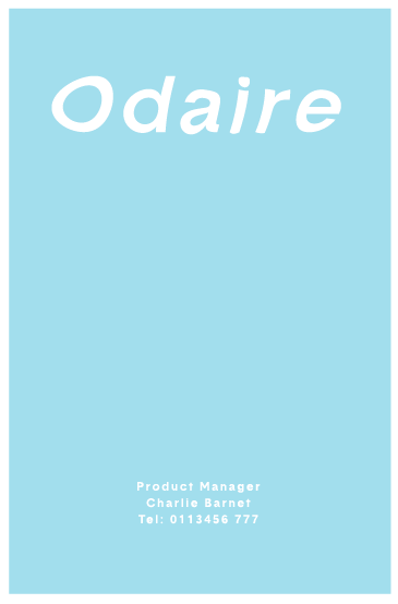
ODAIRE: Ultimately, air fresheners are a pleasant Air Odour, used to mask/ absorb unwanted odours. I took this idea and turned it on its head. Creating Odaire, a french air freshener. Derived from the terms Odour and Air. Creating such a brand also gave me scope to incorporate tongue and cheek humour, as the examples above demonstrate: ODAIRE. BE AWARE. ODAIRE. BE GONE.


Monday 21 April 2014

DK Books - Design

This brief was a spin-off from my Cancer Research brief, therefore all of my research and development has derived from this. I've decided to use this as its own brief because of its submission. It was a brief that was needed as personal growth and hope to secure an internship.

Brief synopsis: DK books are a world leading illustrated reference publisher, I chose the option to generate a double page spread on a topic I felt really strong about. The focus for my DPS was on Skin Cancer and raising awareness among young adults was its priority.


After stumbling across this brief, I thought it was a prime opportunity to experiment with 3D elements just as DK books is famous for, it also provided me with the chance to be creative away from a computer screen, I thought strategically about this brief and consequently tied the double page spread into the deliverables of another brief.

Following my research into DK books and their approaches to Double Page Spreads, I decided that I would incorporate Photography. It was perfect for my subject matter and also referenced the style of DK’s approach. In terms of type, the body copy would be in a simple Sans-Serif  typeface, this is because it insinuates modernity rather than traditions as a Serif typeface would.


For the actual design work of the brief, I made sure that I generated my own typography, this was because my research revealed that hand-drawn type worked more successfully to portray emotion than simple fonts. The images displayed on the top row, depict why I’ve chosen to draw directly onto my chest and surrounding scar. It holds a much more stronger relationship to the skin than overlaying the design I created through illustrator


Final resolution


About Me

My photo
Leeds College of Art. Graphic Design.
 

Copyright 2010. All rights reserved.