Showing posts with label Brief 9. Show all posts
Showing posts with label Brief 9. Show all posts
Wednesday, 21 May 2014
Thursday, 8 May 2014
Yoke - Evaluation
I felt this brief gave me a new experience, it provided me with the opportunity to see my work in an exhibition and actually go and view it. It was an enjoyable experience and has provided me with more motivation to see more work of mine in the public domain and consider freelance work on the side of a job in the industry. The design actually worked really well with what it was paired with. As it was a quick turnaround it gave me the chance to experience juggling different briefs.
Saturday, 12 April 2014
Yoke - Mid Boards

The image above displays the design mine got paired with, I'm happy with the outcome because both the colour and designs have ended up complimenting each other.

Friday, 11 April 2014
Yoke - Design,

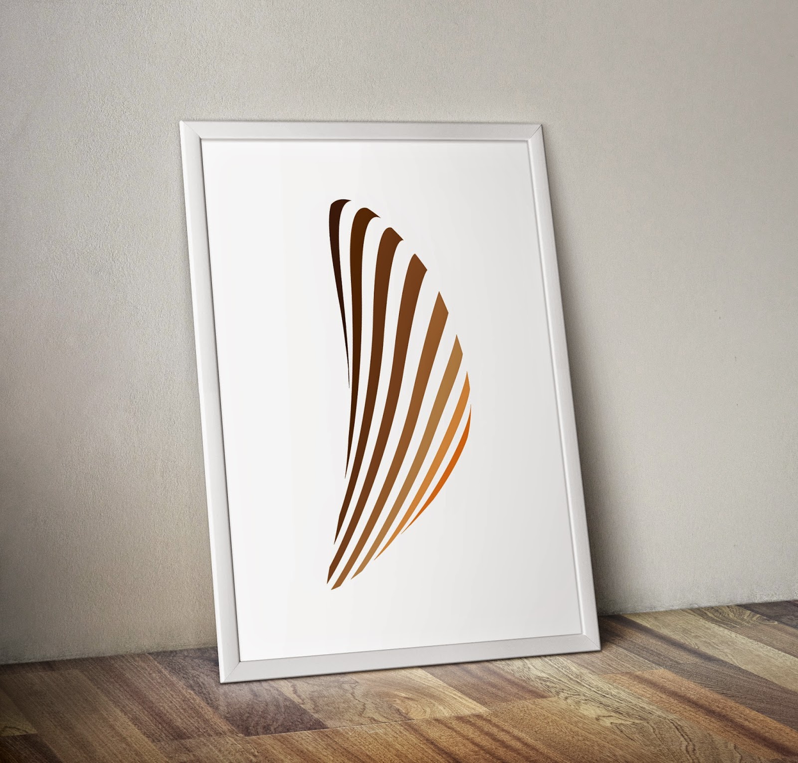
Submission - The frame around the piece completes the design and has been added with the thought of how the other design will be composed. If contained in the frame the piece should look as if it were purposely designed for one another.

Thursday, 10 April 2014
Yoke - Research into sound, visual style
As the brief stated that the concept could spread further afield to what you think communication is today. I instantly thought of music, it was saturating popular culture and fuelling the celebrity culture, as well as supplying role models and speaking to everyone differently dependant on their moods.
With this all in mind, I decided that music was a key point of modern dialogue. I began my research into sound waves and how sound can be depicted in different forms.


The designs above represent my different resolutions to the brief, although the submission design has to be in black (for screenprinting purposes), it would then proceed to be printed in another colour. With this in mind I generated 3 different examples of how colour works successfully in the shape of my design.
Stood on it’s own, the design below has the stronger effect. It would be hard to drown the design by another design over it, due to the spacing in the design and its positioning.


Wednesday, 9 April 2014
Yoke - Brief
Brief synopsis: Yoke is a duo based in leeds with an aim to create an exhibition space that spurs dialogue between creatives. Submissions can take any form of the theme. It could reflect directly on past conversations, forms of interaction or it could spread further afield to what you think communication is today.
To complete this brief I gave myself 2 days. Creating a design that worked successfully on it’s own, and in collaboration with other elements. The focus of my design was on sound and its amplification.


To complete this brief I gave myself 2 days. Creating a design that worked successfully on it’s own, and in collaboration with other elements. The focus of my design was on sound and its amplification.
Subscribe to:
Posts (Atom)
About Me

Copyright 2010. All rights reserved.