Showing posts with label Brief 6. Show all posts
Showing posts with label Brief 6. Show all posts
Wednesday, 21 May 2014
Sunday, 18 May 2014
Cath Kidston - Evaluation
For this brief I was able to gather a large amount of Primary Research, this was because it was a commercial business that was very popular in the public domain. Myself and Josh were also very effective with our research, noticing a gap in the market for this sort of design approach that was suited to the ethos of the company. I suppose the hard thing to this brief was that it was difficult to emulate an existing brand aesthetic, Cath Kidston prints had a stylised look to them which was inspired by the 1950's and 60's conversational patterns. Working collaboratively and trying hard to always be in direct communication worked successfully, we were able to nail down a design approach to our aesthetics and once we'd managed this, the creation of the pattern took shape quite fast.
In terms of strengths, I'm very pleased with how well the pattern designs work together and as a print set that fit alongside Cath Kidston designs. However I regret not spending more time on the final boards of our brief, this was because we only had little time left nearing the end of the design. Maybe one of us should of done the boards prior instead of doing the boards together in University. I also wish we could of maybe spent more time during the selection process of colours, despite these points I'm still very happy with the way they've turned out.
In terms of strengths, I'm very pleased with how well the pattern designs work together and as a print set that fit alongside Cath Kidston designs. However I regret not spending more time on the final boards of our brief, this was because we only had little time left nearing the end of the design. Maybe one of us should of done the boards prior instead of doing the boards together in University. I also wish we could of maybe spent more time during the selection process of colours, despite these points I'm still very happy with the way they've turned out.
Thursday, 8 May 2014


Cath Kidston - Mid Boards
Due to the file size and compression process to upload via 'Issuu', some of the more intricate designs and photographic work has lost some detail. The problem will be rectified by supplying printed versions of these boards.
Cath Kidston - Mock Ups
One of the other requirements of the brief was to show the pattern in context. This needed to be shown across 3 of the product categories: Women’s Fashion, Women’s Accessories and Home. With this in mind we searched the Kidston website to find some relevant products which they have for sale. We then applied the different pattern designs to various products. This confirmed that the patterns worked well with real life products. We were really happy with how the products looked and could definitely see these items in a Cath Kidston store along side the rest of their goods. Our pattern design is in tun with Kidstons Ethos and also design style. You can tell it fits in with the existing designs but also has a slightly more refined modern twist. The different colour schemes work well with the products and there is definitely consistency.


Wednesday, 7 May 2014
Cath Kidston - Colourways
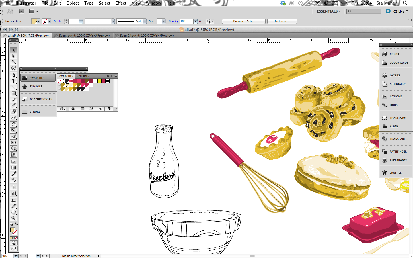
Digitising: To do this we scanned in the illustrations making sure the resolution was turned up and then live traced the designs, from here we used the paint bucket tool to fill in the sections colouring in the tonal differences, we started off using a quite realistic colour scheme making sure all the colours were global so that we could easily experiment with the colour scheme.

The close-up image below displays the conversational print in a more stepped out manner, however we needed to densen the pattern which gave it a different aesthetic. In terms of collaboration I felt me and josh worked successfully together, there were times when our schedule's would clash.


Another one of the requirements of the brief was to present the design in 3 different colour ways we tested several different alternatives but finally settled on these three. These colour ways lent themselves to the elements in the design. The 3 different colour schemes suit the cakes well, referencing different fruits, for instance the jam could be strawberry, raspberry or blue berry. The colour ways are quite different but all work really well with the products.


Cath Kidston - Development
Once we'd decided to pursue the theme of British Cakes, we thought of the possibilities in relation to emphasising British Heritage and Culture. Instead of just having a selection of cakes, we wanted to push the concept further and look at the process of baking and the components involved in it. Looking at utensils and ingredients, components that would work together and create a conversational theme. i.e. form of interaction between elements.
In order to draw the illustrations, we started using visual references, using only their outlines, once we had this, we then added in our own contours and tones etc. During the image collecting we had to make sure the images were all from similar angles so that they sat together nicely when put together.
- Chelsea Buns
- Victorian Sponge Cake
- Swiss Roll
- Battenberg
- Butterfly Buns
- Bakewell Tart
- Upside Down Cake
- Apple Pie
- Swiss Roll


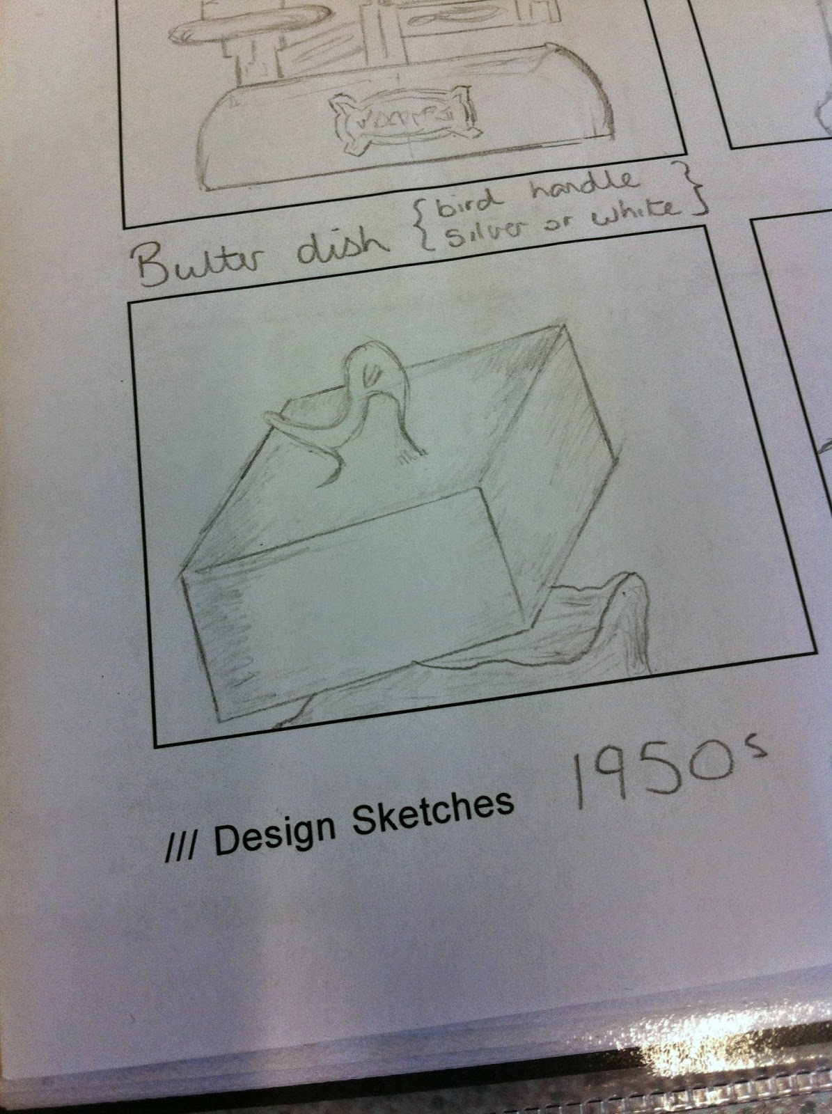


1950's vintage style recipes. They used to print these on the packs of flour and other things like this back in the day. I really like the aesthetic of this style of design, The photos have illustrative qualities, its almost as if they have been drawn with pastels. These recipes also give you an idea of the kind of cakes that were being produced back in the day and give you a sense of what British Cakes were iconic.
We want to recreate the same visual style as Kidston and try and focus on British cakes/baking.


Experimenting with scale; Seen as the pattern will be conversational, this means there will be various components interacting to create a visual dialogue. With this in mind, whatever we designed, HAD to work at a small scale. Below is an example I created to show how our designs would work at different scales.

The process...

Myself and Josh had managed to split the elements equally, discarding various designs along the way, for example. The flour above was discarded because it wasn't as similar as the other elements, there were times when we considered jeopardising the design by using such designs as the one above, however we realised that we had a good concept, and a solid visual style for the other elements we'd designed, therefore it really wasn't worth including one's that didn't suit.


After we'd completed the designing process, I had various attempts at arranging the elements, for aesthetic purposes I arranged the elements as so, this gave me a reference to see what worked well together.


Subscribe to:
Posts (Atom)
About Me

Copyright 2010. All rights reserved.