Once we'd decided to pursue the theme of British Cakes, we thought of the possibilities in relation to emphasising British Heritage and Culture. Instead of just having a selection of cakes, we wanted to push the concept further and look at the process of baking and the components involved in it. Looking at utensils and ingredients, components that would work together and create a conversational theme. i.e. form of interaction between elements.
In order to draw the illustrations, we started using visual references, using only their outlines, once we had this, we then added in our own contours and tones etc. During the image collecting we had to make sure the images were all from similar angles so that they sat together nicely when put together.
- Chelsea Buns
- Victorian Sponge Cake
- Swiss Roll
- Battenberg
- Butterfly Buns
- Bakewell Tart
- Upside Down Cake
- Apple Pie
- Swiss Roll


1950's vintage style recipes. They used to print these on the packs of flour and other things like this back in the day. I really like the aesthetic of this style of design, The photos have illustrative qualities, its almost as if they have been drawn with pastels. These recipes also give you an idea of the kind of cakes that were being produced back in the day and give you a sense of what British Cakes were iconic.
We want to recreate the same visual style as Kidston and try and focus on British cakes/baking.


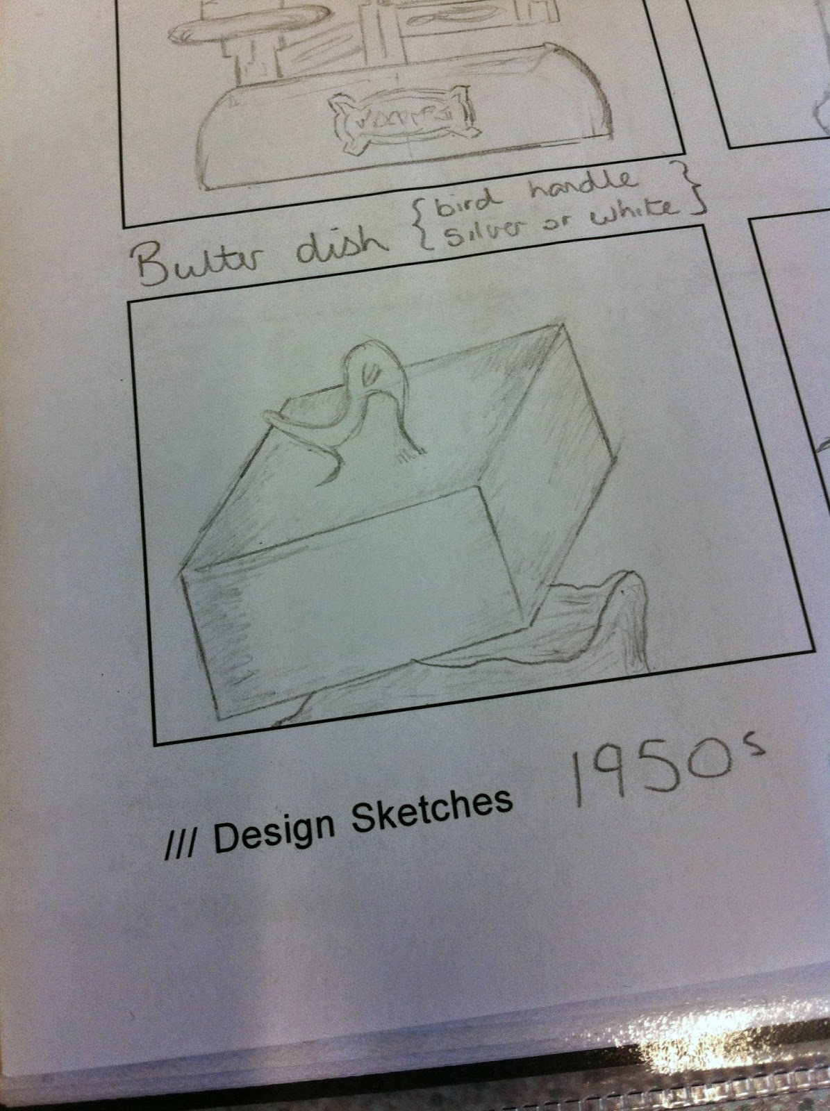
Experimenting with scale; Seen as the pattern will be conversational, this means there will be various components interacting to create a visual dialogue. With this in mind, whatever we designed, HAD to work at a small scale. Below is an example I created to show how our designs would work at different scales.

The process...

Myself and Josh had managed to split the elements equally, discarding various designs along the way, for example. The flour above was discarded because it wasn't as similar as the other elements, there were times when we considered jeopardising the design by using such designs as the one above, however we realised that we had a good concept, and a solid visual style for the other elements we'd designed, therefore it really wasn't worth including one's that didn't suit.


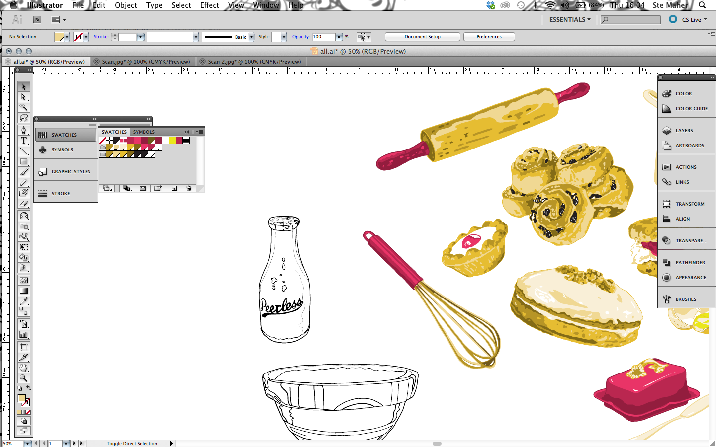

After we'd completed the designing process, I had various attempts at arranging the elements, for aesthetic purposes I arranged the elements as so, this gave me a reference to see what worked well together.


No comments:
Post a Comment