

Primary Photographs.
Wales. Lake District/CenterParcs


At this stage I was very happy with the concept of the logo, however it needed to be made more approachable and less ‘sharp’. The concept has been to combine two prime objects, continuously used in tree surgery, SAW & TREE.
As you can see below, the form of a tree has been created through the build up of chainsaw teeth. Incorporating aspects of colour into my final design created a very perceptual logo, the form of a tree has been created without any attached components. The tree also looks as if it is placed in the ground and the chainsaw teeth add subtle depth to the logo.

The name; Safetree Surgeons - following the grain.
Tree surgeons pride themselves on removing tree’s safetly and
successfully, with this in mind I generated a company name that was approachable and re-assuring, when spoken ‘Safetree’ surgeons can be held to also mean ‘Safety’. Following the grain also emulates that the company is constantly on the search for wood to cut.


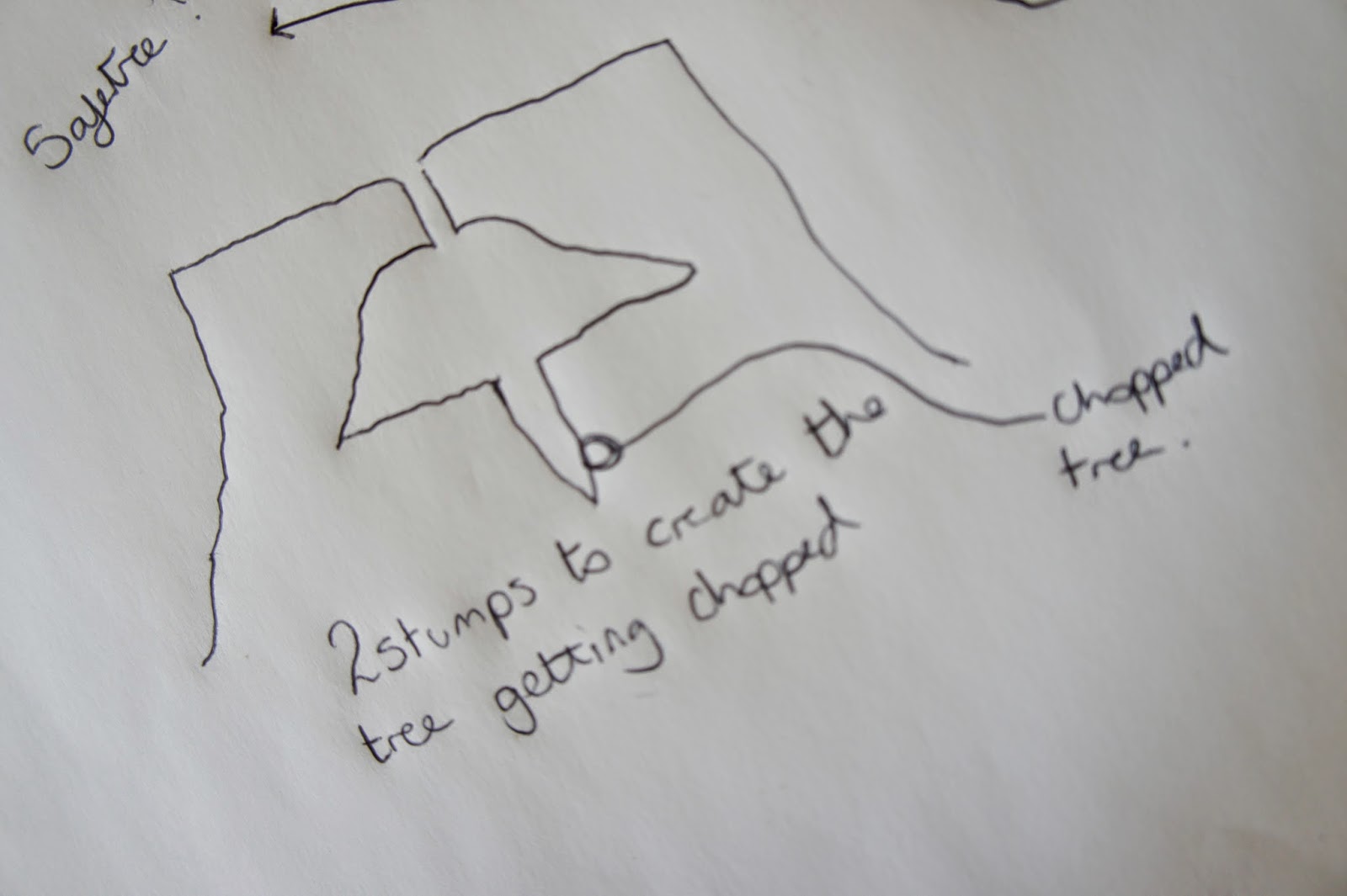
Given the nature of the company I'm branding, I've decided to only brand the core utensils at the heart of this type of occupation.
The logo works effectively, when in the public domain, i.e. passing by on a van or seen on a business card it is very approachable and friendly, and when it comes to the actual job the advertisement of the company looks very professional and corporate - suggesting that they know what they're doing and its safe.


The branding is applied in a simple way, but by having it laid out like this above, it makes it very clear to the people driving past what the company is.

No comments:
Post a Comment